In this article, we’ll explore how to disable the Text Input component in a React Native application using the useState hook and without the use of hooks. As developers, we often need to control user input and interaction, and using hooks provides a modern and efficient way to achieve this. We’ll cover the process step by step, showcasing the power of functional components and hooks.
As a developer, you may find yourself needing to restrict user input at times, and we’ll explore the steps to accomplish this seamlessly. By utilizing the editable={false} and selectTextOnFocus={false} properties, we can effortlessly disable the React Native TextInput view. Let’s dive into the details.
This is the final output you will get watch the video below:
Table of Contents
- Introduction to
useStateHook - Creating a New React Native Project
- Importing Required Components
- Disabling TextInput with Hooks
- Styling the Components
- A complete code to Disable TextInput in React Native using Hooks
- A complete code to Disable TextInput in React Native without Hooks
- Conclusion
- FAQs
1. Introduction to useState Hook
The useState hook is a fundamental part of React that allows functional components to manage state without writing a class. It’s perfect for scenarios like toggling features, managing form fields, or, in our case, disabling a TextInput.
2. Creating a New React Native Project
Ensure you have the necessary environment set up for React Native development. If not, visit the official React Native documentation to get started.
if you wanna know how to create a project with or without expo in detail please visit this post. how to create project with react native
To create a new project, run the following command:
npm init TestProject3. Importing Required Components
In your project, import the necessary components by adding the following lines at the top of your JavaScript file:
import React, { useState } from 'react'; import { StyleSheet, View, TextInput, Button } from 'react-native';4. Disable Text Input with useState
Using the useState hook, we can control whether the TextInput is enabled or disabled. Here’s how you can apply it:
const App = () => {
const [isDisabled, setIsDisabled] = useState(false);
 return (
 <View style={styles.container}>
 <TextInput style={styles.input} placeholder="Enter text" editable={!isDisabled} />
 <Button title={isDisabled ? 'Enable Input' : 'Disable Input'} onPress={() => setIsDisabled(!isDisabled)} />
 </View>
 );
};
5. Styling the Components
To enhance the visual appeal of our components, let’s define some styles:
const styles = StyleSheet.create({
container: {
flex: 1,
justifyContent: 'center',
alignItems: 'center',
backgroundColor: '#FFFFFF',
},
input: {
width: '80%',
height: 40,
borderColor: 'gray',
borderWidth: 1,
paddingHorizontal: 10,
marginBottom: 20,
},
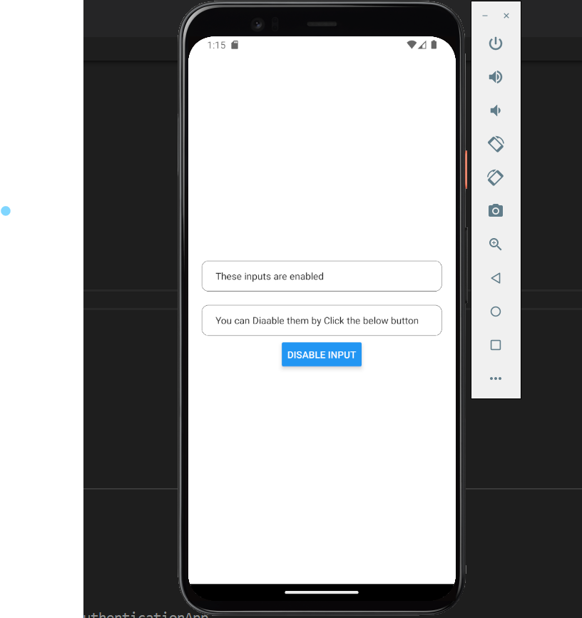
});This is the final output of the code as shown below:

6. Complete Code to Disable Text Input in React Native using Hooks
import { Button, View, TextInput, StyleSheet } from "react-native";
import { useState } from "react";

export default function DisableInput() {
  const [isDisabled, setIsDisabled] = useState(false);

  return (
    <View style={styles.container}>
      <View style={styles.inputContainer}>
        <TextInput
          style={styles.inputs}
          placeholder="First Name"
          underlineColorAndroid="transparent"
          editable={!isDisabled}
        />
      </View>
      <View style={styles.inputContainer}>
        <TextInput
          style={styles.inputs}
          placeholder="Last Name"
          underlineColorAndroid="transparent"
          editable={!isDisabled}
        />
      </View>
      <Button
        title={isDisabled ? "Enable Input" : "Disable Input"}
        onPress={() => setIsDisabled(!isDisabled)}
      />
    </View>
  );
}

const styles = StyleSheet.create({
  container: {
    flex: 1,
    justifyContent: "center",
    alignItems: "center",
    backgroundColor: "#FFFFFF",
    padding: 20,
  },
  inputContainer: {
    borderColor: "#000000",
    borderWidth: 0.5,
    borderRadius: 10,
    backgroundColor: "#FFFFFF",
    height: 45,
    width: "100%",
    marginVertical: 10,
    paddingHorizontal: 10,
  },
  inputs: {
    flex: 1,
    padding: 10,
  },
});
Code Explanation:
This code defines a functional React Native component named DisableInput. Here’s what it does:
- It imports necessary components from React Native and the
useStatehook from React. - The
DisableInputcomponent is defined, which will render two input fields and a button to enable/disable them. - The
useStatehook is used to manage the state of theisDisabledvariable. Initially, the input fields are not disabled (false). - The component’s
returnstatement defines the JSX structure to be rendered.
Inside the return statement:
Viewcomponents are used to structure the UI elements.- Two
TextInputcomponents are created, each wrapped inside aninputContainerstyle.- The
editableprop of eachTextInputis set to!isDisabled, meaning the input fields are editable whenisDisabledisfalse.
- The
- A
Buttoncomponent is used to toggle the input field’s disabled state.- The
titleprop displays “Enable Input” whenisDisabledistrue, and “Disable Input” whenisDisabledisfalse. - The
onPressevent handler toggles the value ofisDisabledusingsetIsDisabled(!isDisabled).
- The
The styles object defined using StyleSheet.create contains various styles used in the component for consistent and visually appealing design.
This code demonstrates a common UI pattern where you have input fields that can be enabled or disabled by clicking a button. When the button is clicked, the state of isDisabled changes, affecting the editable prop of the TextInput components.
7. Complete Code to Disable Text Input in React Native without Hooks
import React, { Component } from "react";
import { Button, View, TextInput, StyleSheet } from "react-native";

export default class DisableInput extends Component {
  constructor(props) {
    super(props);
    this.state = {
      isDisabled: false,
    };
  }

  toggleInput = () => {
    this.setState({ isDisabled: !this.state.isDisabled });
  };

  render() {
    return (
      <View style={styles.container}>
        <View style={styles.inputContainer}>
          <TextInput
            style={styles.inputs}
            placeholder="First Name"
            underlineColorAndroid="transparent"
            editable={!this.state.isDisabled}
          />
        </View>
        <View style={styles.inputContainer}>
          <TextInput
            style={styles.inputs}
            placeholder="Last Name"
            underlineColorAndroid="transparent"
            editable={!this.state.isDisabled}
          />
        </View>
        <Button
          title={this.state.isDisabled ? "Enable Input" : "Disable Input"}
          onPress={this.toggleInput}
        />
      </View>
    );
  }
}

const styles = StyleSheet.create({
  container: {
    flex: 1,
    justifyContent: "center",
    alignItems: "center",
    backgroundColor: "#FFFFFF",
    padding: 20,
  },
  inputContainer: {
    borderColor: "#000000",
    borderWidth: 0.5,
    borderRadius: 10,
    backgroundColor: "#FFFFFF",
    height: 45,
    width: "100%",
    marginVertical: 10,
    paddingHorizontal: 10,
  },
  inputs: {
    flex: 1,
    padding: 10,
  },
});
Code Explanation:
In this version of the code, the DisableInput component is implemented using a class-based approach. The state is managed within the component’s state using the constructor and class methods:
- The constructor initializes the state with
isDisabledset tofalse. - The
toggleInputmethod is defined to toggle theisDisabledstate when the button is pressed. - The
rendermethod defines the component’s UI, similar to the functional component version.
The rest of the code remains the same, including the JSX structure and styling. The TextInput elements’ editable prop and the Button component’s title and onPress event handler are bound to the class component’s state and methods.
8. Conclusion
In this tutorial, we’ve explored how to disable a TextInput component in React Native using the useState hook and without hooks. By leveraging the hook’s state management capabilities, we’ve created a dynamic interface that allows users to enable or disable the input at the press of a button.
For my personal point of view I think using hooks are a better option as it makes your code look clean and easy to understandable. also it increase the code readability and make your code short. So, I think hooks are the better options to use.
FAQs
Q1: Can I disable other components using useState?
A: Yes, you can apply similar logic to other components’ behavior as well, controlling their properties based on the state.
Q2: How can I customize the disabled appearance of the TextInput?
A: You can apply custom styles to the TextInput to make it visually distinct when it’s disabled.
Q3: Is useState the only hook for managing state?
A: No, React offers other hooks like useEffect, useContext, and more for different use cases.
Q4: Can I reset the input field when enabling it again?
A: Yes, you can manage the input field’s value in the state and update it accordingly.
Q5: Where can I learn more about React Native hooks?
A: The official React Native documentation provides comprehensive information on hooks and their usage. Also, there are some custom community hooks that you can use. You can explore both it depends upon your requirements that which hooks you need.