
Welcome to a comprehensive guide that will empower you with the skills and knowledge needed to seamlessly integrate React Native Charts into your mobile app projects. In this guide, we will delve into the dynamic world of mobile app development, where captivating visuals play a pivotal role in engaging users and conveying data stories effectively. Our goal is to equip you with the expertise to create stunning charts using the react-native-chart-kit library, enabling you to elevate both the aesthetics and functionality of your mobile applications.
In the dynamic landscape of mobile app development, the inclusion of captivating visual elements is paramount. This comprehensive guide is dedicated to empowering you with the knowledge and skills to seamlessly integrate React Native Charts into your projects, elevating the aesthetics and functionality of your mobile applications. Through the adept utilization of the react-native-chart-kit library, we will explore the creation of stunning charts that enable you to convey data stories with elegance and precision.
Table of Contents
- Introduction to React Native Charts
- Installing React Native Charts Kit
- Importing Chart Components
- Crafting Line Charts
- Constructing Bar Charts
- Creating Pie Charts
- Exploring Advanced Charts
- Conclusion
Introduction to React Native Charts
In the ever-evolving landscape of mobile app development, the integration of captivating visual elements has become essential to captivate users’ attention and convey data insights. This guide is dedicated to providing you with the tools to seamlessly incorporate React Native Charts into your projects. These charts go beyond simple data representation; they are powerful tools for communicating complex information with elegance and precision.
If you did not created any project yet you can check how to create project with react native
Installing React Native Charts Kit
To embark on this journey of chart integration, your first step involves integrating the react-native-chart-kit library into your React Native project. This process is straightforward and can be achieved using either npm or yarn.
npm install react-native-chart-kit

If Using Yarn then:
yarn add react-native-chart-kit
Importing Chart Components
With the library seamlessly integrated, we gain access to a spectrum of chart components that serve as building blocks for our visualizations. The following import statement provides access to these components:
import { Dimensions } from "react-native";
import {
  LineChart,
  BarChart,
  PieChart,
  ProgressChart,
  ContributionGraph,
  StackedBarChart
} from 'react-native-chart-kit';
These are the components you need to import at the top of the page.
Implementing Charts in React Native
Following is the implementation of different charts in react native with the screenshot and code is also provided.
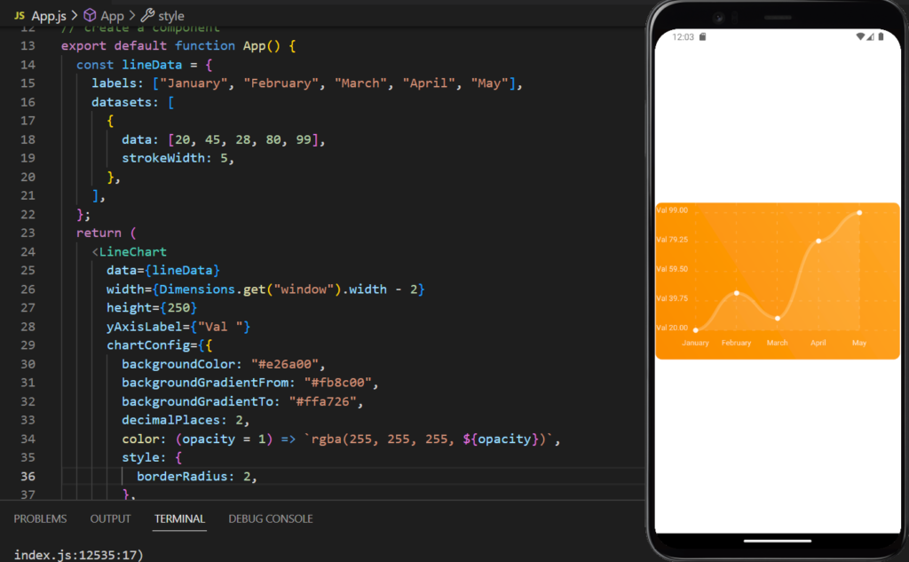
1. Line Chart in React Native:
Line charts are versatile tools for representing data trends over time. Creating a line chart involves providing the necessary data and customizing its appearance. Here’s a basic example illustrating the creation of a line chart:
NOTE:
import { Dimensions } from "react-native";
import {
  LineChart,
  BarChart,
  PieChart,
  ProgressChart,
  ContributionGraph,
  StackedBarChart
} from 'react-native-chart-kit';


export default function App() {
  constData = {
    labels: ["January", "February", "March", "April", "May"],
    datasets: [
      {
        data: [20, 45, 28, 80, 99],
        strokeWidth: 5,
      },
    ],
  };
  return (
    <LineChart
      data={Data}
      width={Dimensions.get("window").width - 2}
      height={250}
      yAxisLabel={"Val "}
      chartConfig={{
        backgroundColor: "#e26a00",
        backgroundGradientFrom: "#fb8c00",
        backgroundGradientTo: "#ffa726",
        decimalPlaces: 2,
        color: (opacity = 1) => `rgba(255, 255, 255, ${opacity})`,
        style: {
          borderRadius: 2,
        },
      }}
      bezier
      style={{
        flex: 1,
        borderRadius: 10,
        justifyContent: "center",
        alignItems: "center",
      }}
    />
  );
}
2. Bar Chart in React Native:
Bar charts are effective tools for comparing data across categories. They provide insights into various aspects such as sales, revenue, and performance. Here’s an example demonstrating the creation of a bar chart:
Following is the end result of bar chart in react native:

NOTE:
  return (
    <BarChart
      data={Data}
      width={Dimensions.get("window").width - 2}
      height={220}
      yAxisLabel={"Val "}
      chartConfig={{
        backgroundColor: "#00a0b0",
        backgroundGradientFrom: "#0083a8",
        backgroundGradientTo: "#007199",
        decimalPlaces: 2,
        color: (opacity = 1) => `rgba(255, 255, 255, ${opacity})`,
        style: {
          borderRadius: 2,
        },
      style={{
        flex: 1,
        borderRadius: 10,
        justifyContent: "center",
        alignItems: "center",
      }}
    />
  );
}
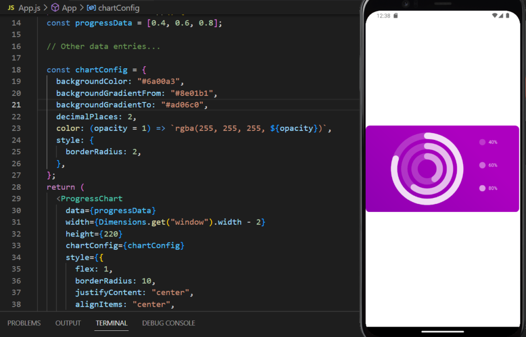
3. Progress Chart in React Native:
A progress chart is a powerful tool for showing progress towards a goal. It tells you how much you have done and on which part you are lacking.
Here’s an example of how to create a progress chart:
NOTE:
export default function App() {
  const progressData = [0.4, 0.6, 0.8];
  const chartConfig = {
    backgroundColor: "#6a00a3",
    backgroundGradientFrom: "#8e01b1",
    backgroundGradientTo: "#ad06c0",
    decimalPlaces: 2,
    color: (opacity = 1) => `rgba(255, 255, 255, ${opacity})`,
    style: {
      borderRadius: 2,
    },
  };
  return (
    <ProgressChart
      data={progressData}
      width={Dimensions.get("window").width - 2}
      height={220}
      chartConfig={chartConfig}
      style={{
        flex: 1,
        borderRadius: 10,
        justifyContent: "center",
        alignItems: "center",
      }}
    />
  );
}
4. Contribution Graph in React Native:
A contribution graph is commonly used to showcase contributions over time, often seen in open-source projects. This type of chart is useful when you are working in a team and want to visualize the work done by each person on different days. This type of graph is also seen on GitHub where different people contribute to a project in different timespan.
Here’s how to create a contribution graph:

NOTE:
export default function App() {
  const contributionData = [
    { date: "2023-01-15", count: 3, color: "rgba(131, 167, 234, 1)" },
    { date: "2023-02-01", count: 8, color: "rgba(131, 167, 234, 1)" },
    { date: "2023-02-21", count: 8, color: "rgba(131, 167, 234, 1)" },
    { date: "2023-03-11", count: 8, color: "rgba(131, 167, 234, 1)" },
    { date: "2023-04-10", count: 8, color: "rgba(131, 167, 234, 1)" },
    // Other data entries...
  ];

  const chartConfig = {
    backgroundColor: "#00a0b0",
    backgroundGradientFrom: "#0083a8",
    backgroundGradientTo: "#007199",
    decimalPlaces: 2,
    color: (opacity = 1) => `rgba(255, 255, 255, ${opacity})`,
    style: {
      borderRadius: 2,
    },
  };
  return (
    <ContributionGraph
      values={contributionData}
      endDate={new Date("2023-12-31")}
      numDays={365}
      width={Dimensions.get("window").width - 2}
      height={220}
      chartConfig={chartConfig}
      style={{
        flex: 1,
        borderRadius: 10,
        justifyContent: "center",
        alignItems: "center",
      }}
    />
  );
}
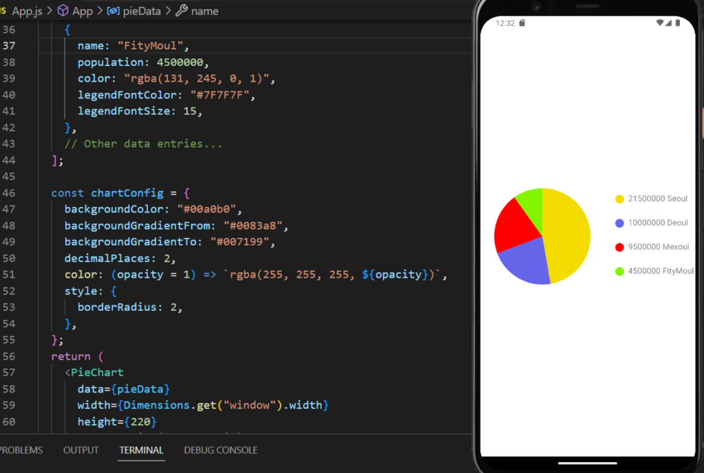
5. Pie Charts:
Pie charts are powerful tools for depicting proportions and percentages, especially when dealing with data divided into distinct categories. This chart is also useful to get the oversight where a group of people have certain type of disease.
Here’s an example showcasing the creation of a pie chart:
NOTE:
export default function App() {
  const pieData = [
    {
      name: "Seoul",
      population: 21500000,
      color: "rgba(245, 220, 0, 1)",
      legendFontColor: "#7F7F7F",
      legendFontSize: 15,
    },
    {
      name: "Deoul",
      population: 10000000,
      color: "rgba(100, 100, 234, 1)",
      legendFontColor: "#7F7F7F",
      legendFontSize: 15,
    },
    {
      name: "Mexoul",
      population: 9500000,
      color: "rgba(255, 0, 0, 1)",
      legendFontColor: "#7F7F7F",
      legendFontSize: 15,
    },
    {
      name: "FityMoul",
      population: 4500000,
      color: "rgba(131, 245, 0, 1)",
      legendFontColor: "#7F7F7F",
      legendFontSize: 15,
    },
  ];

  const chartConfig = {
    backgroundColor: "#00a0b0",
    backgroundGradientFrom: "#0083a8",
    backgroundGradientTo: "#007199",
    decimalPlaces: 2,
    color: (opacity = 1) => `rgba(255, 255, 255, ${opacity})`,
    style: {
      borderRadius: 2,
    },
  };
  return (
    <PieChart
      data={pieData}
      width={Dimensions.get("window").width}
      height={220}
      chartConfig={chartConfig}
      accessor="population"
      backgroundColor="transparent"
      paddingLeft="15"
      absolute
      style={{
        flex: 1,
        borderRadius: 10,
        justifyContent: "center",
        alignItems: "center",
      }}
    />
  );
}
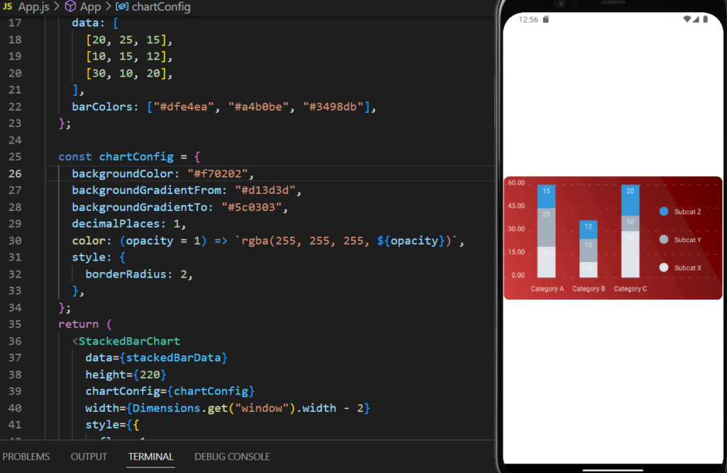
6. Stacked Bar Chart:
A stacked bar chart is useful for visualizing data with multiple categories and subcategories. Here’s an example of how to create a stacked bar chart:
NOTE:
export default function App() {
  const stackedBarData = {
    labels: ["Category A", "Category B", "Category C"],
    legend: ["Subcat X", "Subcat Y", "Subcat Z"],
    data: [
      [20, 25, 15],
      [10, 15, 12],
      [30, 10, 20],
    ],
    barColors: ["#dfe4ea", "#a4b0be", "#3498db"],
  };

  const chartConfig = {
    backgroundColor: "#f70202",
    backgroundGradientFrom: "#d13d3d",
    backgroundGradientTo: "#5c0303",
    decimalPlaces: 1,
    color: (opacity = 1) => `rgba(255, 255, 255, ${opacity})`,
    style: {
      borderRadius: 2,
    },
  };
  return (
    <StackedBarChart
      data={stackedBarData}
      height={220}
      chartConfig={chartConfig}
      width={Dimensions.get("window").width - 2}
      style={{
        flex: 1,
        borderRadius: 10,
        justifyContent: "center",
        alignItems: "center",
      }}
    />
  );
}
Conclusion:
In conclusion, the integration of React Native Charts using the react-native-chart-kit library empowers developers to create visually compelling data visualizations. Through line charts, bar charts, and pie charts, developers can enhance user experiences and deliver insights with clarity. By leveraging the customizable nature of these charts, applications across domains such as finance, analytics, and health can elevate their functionality and aesthetics. As you embark on your charting journey, remember that a visually rich app not only delights users but also communicates complex information effectively.
Incorporating React Native Charts into your mobile applications is a testament to your commitment to delivering user-centric experiences. With this guide as your compass, you possess the knowledge and skills to create beautiful and informative charts that set your applications apart. As you explore this realm further, experiment with various chart types, colors, and configurations to unlock the full potential of data visualization in your React Native projects.