In this article, you will learn “how to use vector icons in react native and also you will get insight which library to use”. We are discussing two famous and imported libraries “Material Icon” one of which is by Google.
Introduction
In the world of app development, creating visually appealing and user-friendly interfaces is paramount. One essential element that can significantly enhance the aesthetics and functionality of your mobile app is React Native Vector Icons. These versatile icons can be seamlessly integrated into your React Native applications, adding a touch of creativity and professionalism. In this article, we’ll explore the world of Vector Icons, providing you with coding examples on how to implement them effectively. Let’s dive in!
Table of Contents
- What Are React Native Vector Icons?
- Why Choose React Native Vector Icons?
- Which Library to Use FontAwesome or Material Community Icon or Material Design ?
- Code Implementation of Vector Icon
- Getting Started: Setting Up Your React Native Project
- Installing and Importing of Icons
- Using Basic Icons
- Customizing Icons
- Working with Icon Sets
- Adding Interactivity with Icons
- Accessibility Considerations
- Performance Optimization
- Conclusion
What Are React Native Vector Icons?
Before we delve into Vector Icons, let’s start with the basics. What exactly are these icons, and why are they essential in mobile app development?
React Native Vector Icons are a collection of customizable, high-quality icons that you can use in your React Native applications. These icons are not just ordinary images; they are vector-based, which means they can be resized without losing quality. This scalability makes them perfect for various screen sizes and resolutions, ensuring a consistent and crisp appearance across devices.
Why Choose React Native Vector Icons?
You might wonder why you should opt for Vector Icons when there are so many other icon libraries out there. Well, here are some compelling reasons:
- Consistency: With React Native Vector Icons, you ensure that your app’s icons look the same on all platforms, be it iOS or Android, providing a unified user experience.
- Customizability: These icons are highly customizable. You can change their color, size, and even add effects like shadows or gradients to match your app’s design perfectly.
- Performance: They are lightweight and optimized for performance, ensuring that your app remains fast and responsive.
- Accessibility: They come with built-in accessibility features, making your app more inclusive and user-friendly.
Which Library to Use FontAwesome or Material Community Icon or Material Design ?
FontAwesome, Material Icons, and Material Community Icons are all popular icon libraries used in web and mobile app development. Each of them has its own characteristics and strengths, making them suitable for different scenarios. The choice of which one to use depends on your specific project requirements and design preferences. Let’s explore the differences and when each one might be the best choice:
FontAwesome:
- Characteristics: FontAwesome is a versatile icon library that offers a wide range of icons covering various categories, including technology, transportation, business, and more. It’s known for its extensive customization options, allowing you to adjust icon size, color, and styles to match your app’s design.
- Strengths: FontAwesome is highly customizable and has a large and active community, which means you can find plenty of resources, tutorials, and community-created icons. It’s a good choice if you need flexibility and a diverse set of icons for different use cases.
- Use Cases: FontAwesome is suitable for projects where customization and versatility are essential. It’s often chosen when developers want a wide selection of icons to choose from and the ability to adapt those icons to fit their app’s unique style.
Material Icons:
- Characteristics: Material Icons are Google’s official icon library, designed to align seamlessly with Material Design principles. This library provides icons for common actions, system icons, and more, following Google’s design guidelines for consistency.
- Strengths: Material Icons are perfect for projects that follow Material Design principles. They offer a cohesive and consistent design language, ensuring a clean and unified look in apps. If you’re using other Google services or products, Material Icons integrate well with them.
- Use Cases: Material Icons are an excellent choice for apps that prioritize adherence to Material Design guidelines, especially if your app is part of the Google ecosystem. They provide a straightforward way to achieve a consistent and modern look.
Material Community Icons:
- Characteristics: Material Community Icons are a community-driven set of icons that expand on Google’s Material Icons. They include additional icons not found in the official Material Icons library.
- Strengths: Material Community Icons are suitable when you want to follow Material Design principles but need a broader selection of icons beyond what’s offered in the official Material Icons library. They maintain the same design language and consistency.
- Use Cases: Material Community Icons are ideal for projects that need to align with Material Design but require more specialized icons not available in the official set. They offer a balance between adherence to Material Design guidelines and additional customization.
Final Thoughts Which One to Use:
- If you prioritize customization, versatility, and a wide range of icon options, FontAwesome is a strong choice.
- If your project follows Material Design guidelines and aims for a consistent and cohesive design language, Material Icons are a great fit.
- If you need the flexibility of Material Design but require additional icons, consider Material Community Icons to expand your icon selection.
Ultimately, the choice comes down to your project’s visual style and the specific icons you need. If you want a wide range of icons across various categories and enjoy customization options, FontAwesome may be the better choice. On the other hand, if you’re following Material Design principles and want icons that seamlessly blend into that design language, Material Icons might be the preferred option.
But in my opinion Material Community Icons are best to use as they are built on top of Material Icons which are stylish and modern by looks and also have large number of icons more than FontAwesome.
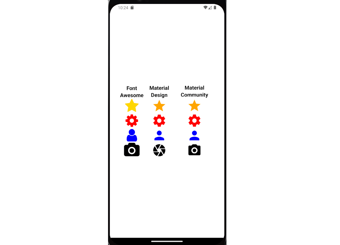
What the icons look like :
NOTE:
Code Implementation of Vector Icon
Getting Started: Setting Up Your React Native Project
To start using this feature, you need a React Native project up and running. If you don’t have one, here’s a quick overview of setting it up:
- Install Node.js: Ensure you have Node.js installed on your system. You can download it from the official website.
- Install React Native CLI or Expo: If you haven’t installed yet, follow the post, create new project.
Installing and Importing React Native Vector Icons
With your React Native project set up, it’s time to add React Native Vector Icons to your project. Here’s how you can do it:
- Install React Native Vector Icons Package: In your project directory, run the following command to install the package:
npm install react-native-vector-icons --saveUsing Basic Icons
Now that you have Vector Icons installed and imported let’s explore how to use basic icons in your app. Here’s a simple example:
How to use FontAwesome in React Native ?
import React from 'react';
import { View } from 'react-native';
import FontAwesomeIcons from 'react-native-vector-icons/FontAwesome';

const MyIconComponent = () => {
  return (
    <View>
      <FontAwesomeIcons name="heart" size={30} color="red" />
    </View>
  );
};

export default MyIconComponent;
In this example, we’ve created a component that renders a heart icon from FontAwesomeIcons. You can customize the icon’s size, color, and name according to your preferences.
Customizing Icons:
Vector Icons in react native offer extensive customization options. You can change the icon’s color, size, and even apply styles to it. Here’s an example of customizing an icon:
import React from 'react';
import { View, StyleSheet } from 'react-native';
import FontAwesomeIcons from 'react-native-vector-icons/FontAwesome';

const MyCustomIcon = () => {
  return (
    <View>
      <FontAwesomeIcons
        name="star"
        size={50}
        color="#FFD700"
        style={styles.customIcon}
      />
    </View>
  );
};

const styles = StyleSheet.create({
  customIcon: {
    textShadowColor: 'rgba(0, 0, 0, 0.75)',
    textShadowOffset: { width: -1, height: 1 },
    textShadowRadius: 10,
  },
});

export default MyCustomIcon;
In this example, we’ve customized a star icon’s size, color, and added a text shadow to give it a unique look.
How to Use Material Icons in React Native ?
React Native Vector Icons provide a wide range of icon sets, each with its unique icons. Let’s see how to work with different icon sets:
import React from 'react';
import { View } from 'react-native';
import MaterialIcons from 'react-native-vector-icons/MaterialIcons';

const MyMaterialIcon = () => {
  return (
    <View>
      <MaterialIcons name="attach-file" size={30} color="black" />
    </View>
  );
};

export default MyMaterialIcon;
In this example, we’ve imported icons from the MaterialIcons set and used the “attach-file” icon. You can explore various icon sets and choose the ones that best suit your app’s design.
How to Use Material Community Icons in React Native ?
Vector Icons in react native provide a wide range of icon sets, each with its unique icons. Let’s see how to work with different icon sets:
import React from 'react';
import { View } from 'react-native';
import MaterialCommunityIcons from "react-native-vector-icons/MaterialCommunityIcons";

const MyMaterialIcon = () => {
  return (
    <View>
      <MaterialCommunityIcons name="attach-file" size={30} color="black" />
    </View>
  );
};

export default MyMaterialIcon;
How to made vector icons Clickable ?
Vector Icons in react native can be interactive elements in your app. For instance, you can add a touch event to an icon to trigger specific actions. Here’s a simplified example:
import React from 'react';
import { View, TouchableOpacity, Alert } from 'react-native';
import FontAwesomeIcons from 'react-native-vector-icons/FontAwesome';

const MyInteractiveIcon = () => {
  const handleIconPress = () => {
    Alert.alert('Icon Pressed', 'You tapped the heart icon!');
  };

  return (
    <View>
      <TouchableOpacity onPress={handleIconPress}>
        <FontAwesomeIcons name="heart" size={30} color="red" />
      </TouchableOpacity>
    </View>
  );
};

export default MyInteractiveIcon;
In this example, we’ve wrapped the heart icon in a TouchableOpacity component, making it clickable. When tapped, it displays an alert message.
Some Common Names that You Can Use:
Here are some common icon names that you can use from the FontAwesome and Material Icons sets in React Native Vector Icons:
FontAwesome Icons:
heart: A heart icon, often used to represent likes or favorites.star: A star icon, commonly used for rating or favoriting items.user: A user icon, typically used to represent user profiles or accounts.shopping-cart: A shopping cart icon, ideal for e-commerce and shopping apps.camera: A camera icon, used to indicate taking photos or capturing images.search: A search icon, often used to trigger a search function in apps.lock: A lock icon, representing secure or locked content.cog: A cog icon, typically used for settings or configurations.envelope: An envelope icon, indicating email-related actions or messages.bell: A bell icon, often used for notifications or alerts.
Material Icons:
home: A home icon, typically used to navigate back to the app’s main screen.notifications: A notifications icon, indicating new messages or alerts.search: A search icon, often used to trigger a search function in apps.settings: A settings icon, used to access app settings and configurations.email: An email icon, representing email-related actions or messages.menu: A menu icon, commonly used for navigation menus.person: A person icon, typically used to represent user profiles or accounts.shopping-cart: A shopping cart icon, ideal for e-commerce and shopping apps.phone: A phone icon, often used to indicate contact or calling features.favorite: A favorite icon, used to mark items as favorites or liked.
Material Community Icon:
account: Represents a user or user profile, often used in apps for account settings or user-related actions.alarm: An icon typically associated with setting alarms or reminders in clock or scheduling apps.calendar: Depicts a calendar, often used for date-related actions or events.camera: Symbolizes a camera, commonly used in photography or camera apps.chat: Represents communication or messaging, often found in chat applications.email: An envelope icon signifying email-related actions, like composing or sending emails.food: An icon related to food or dining, frequently used in restaurant or recipe apps.home: Symbolizes a home or main screen, often used for navigating back to the app’s main page.location: Depicts a map pin, indicating location or maps-related actions.music: A musical note icon, typically used for music or audio-related features.
These are popular and widely recognized icons from the FontAwesome, Material Icons and Material Community Icons sets. You can easily integrate them into your React Native applications to enhance your app’s user interface and functionality.
Accessibility Considerations
Accessibility is a crucial aspect of app development. React Native Vector Icons come with built-in accessibility features, making your app inclusive to all users. Ensure you provide meaningful labels to your icons, especially if they convey important information.
Performance Optimization
To keep your app running smoothly, remember to optimize the use of React Native Vector Icons. Avoid using too many icons on a single screen and use icon sets efficiently to minimize bundle size.
Conclusion
In conclusion, React Native Vector Icons are a valuable asset for enhancing the visual appeal and functionality of your mobile app. They offer consistency, customizability, and performance, making them a top choice for developers. By following the steps outlined in this article, you can effortlessly integrate and use these icons in your React Native projects.
Frequently Asked Questions (FAQs)
1. What makes React Native Vector Icons different from regular icons?
React Native Vector Icons are vector-based, allowing for scalability without loss of quality. They are highly customizable and optimized for performance, making them ideal for mobile app development.
2. How can I add React Native Vector Icons to my React Native project?
You can add React Native Vector Icons by installing the package using npm and then linking it to your project. Import the icons you need in your JavaScript files.
3. Are React Native Vector Icons accessible?
Yes, these icons come with built-in accessibility features, making them accessible to all users. Ensure you provide appropriate labels for your icons to enhance accessibility further.
4. Can I use different icon sets within the same project?
Yes, you can use multiple icon sets within the same project. Import the desired icon set and use icons from that set in your components.
5. How do I ensure optimal performance when using React Native Vector Icons?
To maintain optimal performance, avoid using an excessive number of icons on a single screen and use icon sets efficiently to minimize the bundle size.
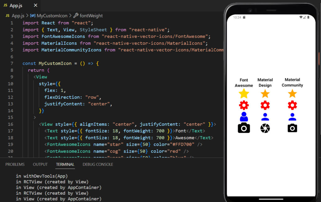
Code For Visualization of Vector Icon:
import React from "react";
import { Text, View, StyleSheet } from "react-native";
import FontAwesomeIcons from "react-native-vector-icons/FontAwesome";
import MaterialIcons from "react-native-vector-icons/MaterialIcons";
import MaterialCommunityIcons from "react-native-vector-icons/MaterialCommunityIcons";

const MyCustomIcon = () => {
  return (
    <View
      style={{
        flex: 1,
        flexDirection: "row",
        justifyContent: "center",
      }}
    >
      <View style={{ alignItems: "center", justifyContent: "center" }}>
        <Text style={{ fontSize: 18, fontWeight: 700 }}>Font</Text>
        <Text style={{ fontSize: 18, fontWeight: 700 }}>Awesome</Text>
        <FontAwesomeIcons name="star" size={50} color="#FFD700" />
        <FontAwesomeIcons name="cog" size={50} color="red" />
        <FontAwesomeIcons name="user" size={50} color="blue" />
        <FontAwesomeIcons name="camera" size={50} />
      </View>

      <View
        style={{
          justifyContent: "center",
          marginHorizontal: 20,
          alignItems: "center",
        }}
      >
        <Text style={{ fontSize: 18, fontWeight: 700 }}>Material</Text>
        <Text style={{ fontSize: 18, fontWeight: 700 }}>Design</Text>
        <MaterialIcons name="star" size={50} color="orange" />
        <MaterialIcons name="settings" size={50} color="red" />
        <MaterialIcons name="person" size={50} color="blue" />
        <MaterialIcons name="camera" size={50} color="black" />
      </View>

      <View
        style={{
          justifyContent: "center",
          marginHorizontal: 20,
          alignItems: "center",
        }}
      >
        <Text style={{ fontSize: 18, fontWeight: 700 }}>Material</Text>
        <Text style={{ fontSize: 18, fontWeight: 700 }}>Community</Text>
        <MaterialCommunityIcons name="star" size={50} color="orange" />
        <MaterialCommunityIcons name="cog" size={50} color="red" />
        <MaterialCommunityIcons name="account" size={50} color="blue" />
        <MaterialCommunityIcons name="camera" size={50} color="black" />
      </View>
    </View>
  );
};

const App = () => <MyCustomIcon />;

export default App;